The COT report can provide a window into what large institutional traders are doing. This is a great way to identify the trend.
Commodity traders have access to a special market report each week that provides a snapshot of the positions of large institutional traders and small speculators in each commodity futures category. This information is called the commitment of traders report or “COT report” and is provided by the Commodity Futures Trading Commission.
Video Analysis: Behind the COT Report
The COT report is a great analytical tool for traders in any market because it provides up to date information about the trend and the strength of the commitment traders have towards that trend in each of the commodities markets. The COT report is also available on the most actively traded futures contracts such as stock indexes, interest rates and currencies..
The COT report essentially shows the net long or short positions for each available futures contract for three different types of traders. If traders are overwhelmingly long or increasing their long positions then we will have a bullish bias on that market. Similarly, if traders are short or increasing their short positions then we will have a bearish bias.
Not all traders in the report are of equal importance. In fact, of the three types of traders, investors usually pay attention to the one type with requirements most like the individual trader.
1. Commercial Traders: These traders represent companies and institutions who use the futures market to offset risk in the cash or spot market. For example, a corn producer may short corn futures contracts to protect her profits if prices fall in the near term. This class of trader is not going to be very helpful for retail investors and we don’t pay much attention to them.
2. Non-Commercial Traders: This category includes large institutional investors, hedge funds and other entities that are trading in the futures market for investment and growth. They are typically not involved directly in the production, distribution or management of the underlying commodities or assets. We pay the most attention to this category.
3. Non-Reporting Traders: This is the catch-all category for traders too small to be required to report their positions to the CFTC. We don’t know how many individual traders there are or what kind of investors they represent because they are non-reporting. Most market professionals assume that a major percentage of this category are individual speculators. They are notoriously bad traders and you will more often see this category betting against the trend than with it. We don’t pay any attention to this category.
Knowing what the big traders (non-commercials) are doing through the COT report gives us some idea about the trend for a particular asset class. We can use these reports to see what the big money is doing in just about any asset class. There are COT reports for equity investors (stock futures), commodity traders (including oil and gold) and currency traders (very important for spot FX traders.)
The COT reports can be used to follow traders in the commodities and stock markets.
The commitment of traders or “COT” report is useful but the raw data from the CFTC can be a little dense and confusing without some historical context. It is usually more helpful to be able to see changes within the information over time rather that just a single snapshot. Historical graphs of the COT report data can solve this problem very effectively.
Video Analysis: Behind the COT Report – Part Two
You can find and examine the report by hand each week and construct a graph yourself for the commodities you are trading. The CFTC releases the data on Fridays but the report is current as of the Tuesday before each Friday’s release. The data is available from the CFTC’s website and is prominently featured right from the home page.
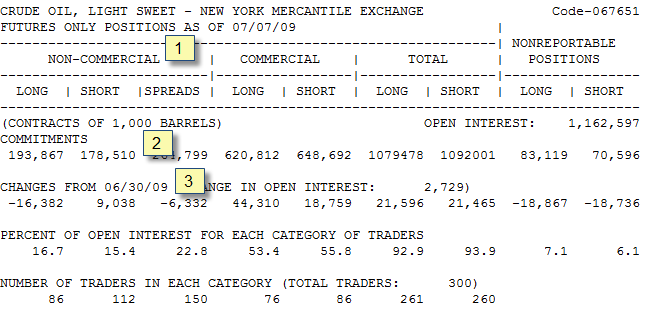
If you want to track the COT data changes each week the numbers are contained within a long text file. You can see an example of what this looks like below with crude oil futures. I have highlighted a few features that I have already talked about in the last section.
1. The non-commercial traders is the column you want to examine most closely. The commercial traders to the right are mostly hedging and will often be positioned in the opposite direction of the non-commercial investors or speculators.
2. As you can see there is a mild bias towards long positions in oil among the non-commercial traders. This is technically bullish but there are warning signs on the horizon.
3. The change in long or short positions can tell us a little bit about the trend in investor sentiment. Long positions have declined since last week and short positions have increased. This seems to indicate that there is some decline in bullish sentiment.
COT Report for Crude Oil

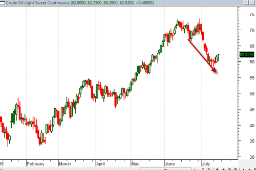
The decline in bullish sentiment has been trending like that since mid-June before this particular image was taken. You can see the market’s reaction to declining investor bullishness in the chart of crude oil below. As investor sentiment cools, traders may become more cautious about their risk exposure with tighter stops or protective options.
Daily Price Chart for Crude Oil

As I mentioned above, the weekly data is useful but seeing the information within a chart to gather historical context can provide additional insight. There are several excellent, free sources for these kinds of charts on the internet. Alternatively you can compile your own version for the commodity contracts you want to see.
The COT report shows how committed the large institutional “non-commercial” traders are to long or short positions within each currency pair. If traders are net short, the COT graph will show a negative position and if they are net long the COT graph will show a positive position. The COT charts also illustrates the rate of change within those long or short balances.
In the video I will show you an example of the net position held by these large traders in the EUR/USD at the time it was recorded. Currency COT charts are particularly useful as they can be used to infer sentiment in related markets. For example, a falling USD/CAD is likely bullish for oil while a falling AUD/USD is probably bad for gold.
If you are interested in doing some independent research on the COT report you can get it free from the CFTC’s website at www.cftc.gov.
The COT report can be used in the same way that you might use a traditional technical indicator that only analyzes price and time. For example, we can apply filters to the report in order to understand not just whether traders are net long or short but whether they are becoming more or less bullish and bearish. That shift in investor sentiment can help predict the “flip” and can even be used to trigger a trade entry or exit.
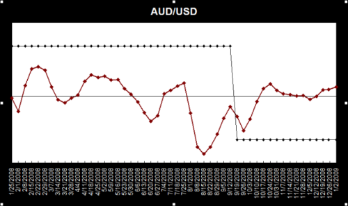
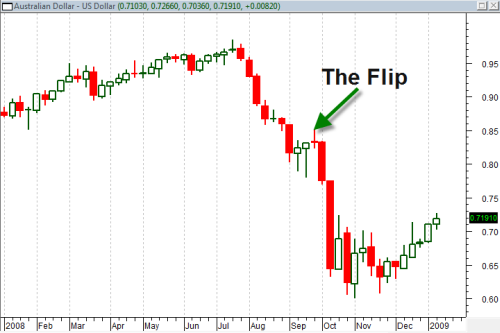
The chart below shows the COT report graph for the AUD/USD. You can see the flip from net long to net short on 9/19/2008. That is not much of a surprise considering price action at the time. You can see what was happening on the price chart below. The black line in the COT chart shows whether traders were net long or short but the red line further analyzes this data to show the rate of change in that net short bias.
The AUD/USD COT report graph

Weekly Chart of AUD/USD covering the same period as the COT chart above

As you can see above, traders were net short but had been trending more towards bullishness than bearishness based on the red line which measures the rate of change of that sentiment. With this information you could assume that the underlying trend is down (based on the black line) but another flip could occur in the near term (based on the uptrending red line.) Building trading systems around this information or using it to define your own bias is relatively simple. Here are two example uses for this information.
1. Building a simple system from this information is relatively easy. For example, assume that you bought the currency pair every time the red sentiment line crossed above the mid point of the graph and reversed and shorted the currency pair when the sentiment line crossed below the mid point or neutral level of the graph. That is a simple example but could be quite effective when combined with a diversification strategy and appropriate risk management. In the video that accompanies this article Wade Hansen, one of the editors here at Learning Markets, will illustrate a system like that and what kind of returns it has delivered in the past.
2. Both the sentiment line (red) and the net long/short line (black) are important trend indicators. Short term traders may use the sentiment line to define what kind of trades they are looking for (long or short) based on the direction or trend of the red line. Longer term traders may only select trades that conform to the net long or short position of the black line. These can be an easy way to define investor sentiment and to understand the strength (or weakness) of the underlying trend.
The video in today’s article was a live presentation given by Wade Hansen in 2008. Wade developed the COT report graph including the calculations behind its sentiment line. He has tested the system in the live market and on past data and will share some of his findings in the presentation. The COT report is released each week after market close on Friday.